The Best Types of Re-Engagement Email (+8 Useful Examples)
Including 32 Re-Engagement Subject Lines Proven to Work on Stubborn, Lazy, Lifeless Subscribers
by Terran Mazzaglia
Introduction
Email is still the primary channel used by businesses to communicate with their customers. Nothing says “you’re important to us” quite like a well-crafted re-engagement email.
This article will provide a deep dive into the role of email in re-engagement marketing campaigns, including insight into best practices, popular subject lines and an analysis of real world examples.
What is a Re-engagement Email?
Re-engagement emails are messages that target past customers or inactive subscribers for conversion. These emails are designed to win back anyone who may have slipped into inactivity. They are a vital feature of any re-engagement campaign.
Some subscribers that need re-engagement include:
- inactive recipients or non-openers
- non-clickers who open but don't engage
- non-converters who haven't made a purchase
- customers who have abandoned actions
- opt-out or opt-down subscribers
- lapsed long-term customers
- past customers who have stopped engaging
- those with expiring subscriptions
For each of these groups, a tailored re-engagement email can be the spark that reignites their interest in your brand.
The Best Types of Re-engagement Email to Send
If you're looking to reconnect with inactive subscribers, re-engagement emails can be your best friend. There are a range of categories to choose from, each serving a unique purpose. From reminders about abandoned actions to thank you emails, there's something for every situation.
Abandoned Action Emails: Give a friendly nudge to customers who started but didn’t finish a process. Abandoned carts are the most common, but you can send a message to those who did not complete a form submission or download as well.
Discount and Promotional Emails: Everyone loves a good deal. Exclusive sales and promotion offers can encourage inactive subscribers to visit your site. Similar to how a clothing retailer sends discount codes to customers who haven’t shopped in a while.
Educational Emails: Offering knowledge to your customers is a solid re-engagement strategy, especially in B2B email. This strategy works best when providing real value based on their industry pain points.
Event Invitations: Inviting customers to webinars, product launches, or workshops can give them new ways to interact with your brand. A successful event invitation also provides another marketing touchpoint for that lead.
Milestone Emails: Celebration time! Acknowledging a customer’s anniversary or birthday, or a company milestone, can evoke positive engagement. For example, a coffee shop could send a special offer to celebrate a customer’s one-year membership.
Preference Emails: Kindly asking about recipients’ email preferences shows you care. Over time, respecting their choices and inbox helps to encourage long-term engagement. To start, ask readers how frequently they’d like to receive updates.
Product or Service Updates: Unveiling new product features or services can re-spark interest among customers - like a rejuvenating pep talk for your brand. For instance, a software company releasing an update could reach out to users who stopped using a previous version.
Thank You Emails: Nurture relationships by expressing appreciation, without pushing for a sale. An email simply thanking a customer for their loyalty can strengthen the relationship. Send these messages every time a ‘thank you’ is appropriate.
See also: 26 Real Ways to Increase Engagement in Email
Examples of Eight Different Kinds of Re-engagement Emails
Ready to see what great re-engagement emails look like? In each category, we'll examine a top-notch example that's really hitting the mark. Then, point out what sets these emails apart and what unique tactics they use to re-engage subscribers. From promotional discounts to event invitations, these examples will give you the inspiration you need.
Abandoned Action Re-engagement Email - Pipcorn Heirloom Snacks
A family-owned business, Pipcorn is a snack company that specializes in healthy alternatives. Their snacks are all-natural, and the brand is known for their sustainability efforts.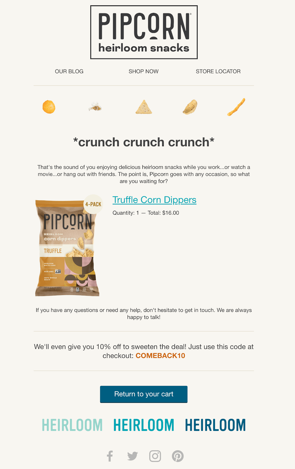
How it Works:
Pipcorn's abandoned cart email works because it engages subscribers in a fun way. It starts with the attention-grabbing humorous line - "crunch crunch crunch," creating a fun and informal tone. Then smoothly transitions into a mouthwatering description of their product. Causing the email to feel friendly rather than pushy.
They also make excellent use of visual space, showcasing vibrant images of their snacks. Pipcorn highlights the abandoned product with a large image in the center of the body. Underneath, they add a 10% off coupon as an incentive to complete the purchase.
The email rounds off with an open invitation for help, emphasizing customer service and a clear Call to Action - "return to your cart". Considering their effective branding and clear messaging, this is an outstanding re-engagement email.
Discount and Promotional Re-engagement Email - Fiverr
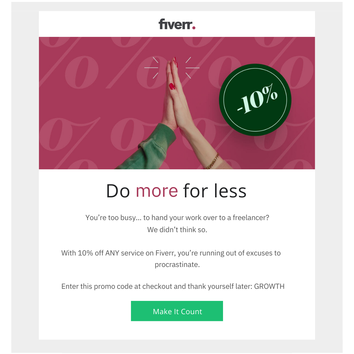
Fiverr is a global online marketplace that connects businesses with freelancers offering digital services. It hosts a range of categories from graphic design to digital marketing, catering to various business needs.
How it Works:
Fiverr's discount email starts with a clear, enticing header image that boldly advertises their 10% offer. The witty phrases like "do more for less" and "you're too busy... to hand your work over to a freelancer?" highlight the value of the offer in a memorable and engaging way.
The discount itself is emphasized in bold text, as it urges us to stop procrastinating. This motivational tone enhances the impact of the email.
Fiverr also includes simple instructions for applying the promo code, which is a great way to reassure subscribers of the process.
At the bottom, a distinctive green "Make It Count" CTA button stands out on the white background. Using a strong image and compelling text to drive users to take action.
The consistent theme of this email is another strength, maintaining focus on growing your business with Fiverr. Even the promo code “growth" aligns with this central message, enhancing the topic.
Educational Re-engagement Email - Net Atlantic
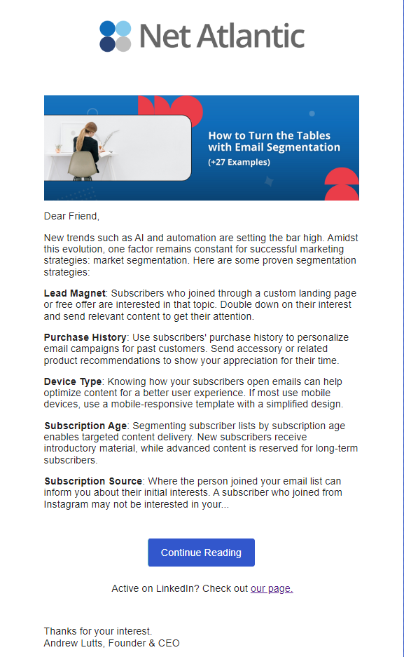
Net Atlantic is a leading email marketing company. Net Atlantic's robust email marketing platform ensures high delivery, positive subscriber engagement, and highly effective email campaigns.
How it Works:
Net Atlantic's educational email engages subscribers by providing meaningful content upfront. A clear banner image represents the brand and topic, setting the stage for the email's topic. Then the causal "Dear Friend" greeting enhances personalization, making the reader feel included.
A hook sentence pulls the reader in, followed by a sneak peek of the article's content to stimulate reader interest. The email effectively capitalizes on the reader's curiosity by offering five of the strategies, cutting one short. Then incentivizes website visits with a distinct "Continue Reading" call-to-action button.
Net Atlantic also makes great use of a secondary CTA, inviting readers to visit their LinkedIn page. Offering another engagement pathway is a great way to catch those not interested in the material.
Lastly, the sign-off from Net Atlantic's CEO adds a personal touch. Reinforcing the idea that real people are behind the brand. The combination of these elements results in a powerful re-engagement email strategy for any industry.
Event Invitation Re-engagement Email - Canva
Canva is a user-friendly browser design tool for those without any design experience. It allows users to create high quality graphics using a library of digital assets and templates.

How it Works:
Canva's weekly #CanvaDesignChallenge email takes advantage of competition and creativity to re-engage users. By inviting them to participate in a design contest, it turns brand engagement into an exciting event. The reward of showcasing winning designs to the Canva community acts as the desirable incentive.
The email opens with a direct challenge to the user, followed by a clear CTA to "Start Designing". An inspiring image displaying what is possible with Canva divides the email. Separating the introduction from the challenge instructions, which are presented in a clean list.
The email also features designs from past winners, proving the value of participation. Included throughout the email are three "Start Designing" buttons, giving the reader many chances to click through. To wrap up the email they use one more reassuring sentence and CTA, acting as a last nudge.
Canva's email layout is optimized for quick readability, allowing subscribers to easily scan key points. Moreover, it addresses all essential aspects of the event - who, what, when, where, why, and how - making it a one stop re-engagement message.
Milestone Re-engagement Email - Grammarly
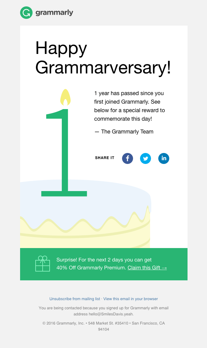
Grammarly is an online writing tool that helps improve grammar, punctuation, and style. It also offers improvements, making it a valuable asset for professionals, students, and writers alike.
How it Works:
Grammarly's anniversary email capitalizes on simplicity and personalization. Titled "Happy Grammarversary!", it cleverly incorporates the brand name into a celebratory greeting, catching the reader's attention.
The email's focus is on the customer, not the brand, which enhances the personal feel. This is a 'thank you' note, appreciating their time spent with Grammarly. As a token of gratitude, a 40% off coupon on Grammarly premium is offered. This 'gift', signed by the Grammarly team, motivates the reader to upgrade, while simultaneously making them feel special.
Furthermore, the inclusion of social sharing icons invites recipients to share their milestones. Fostering organic online engagement and showcasing customer loyalty.
By combining simplicity, personalization, and a considerate offer, they seamlessly encourage user engagement. Grammarly's milestone email strengthens the bond between the customer and the brand.
Preference Emails - Bespoke Post
Bespoke Post is a monthly subscription service that delivers themed subscription boxes of curated goods. By focusing on lesser-known brands, each box provides a unique experience.
How it Works:
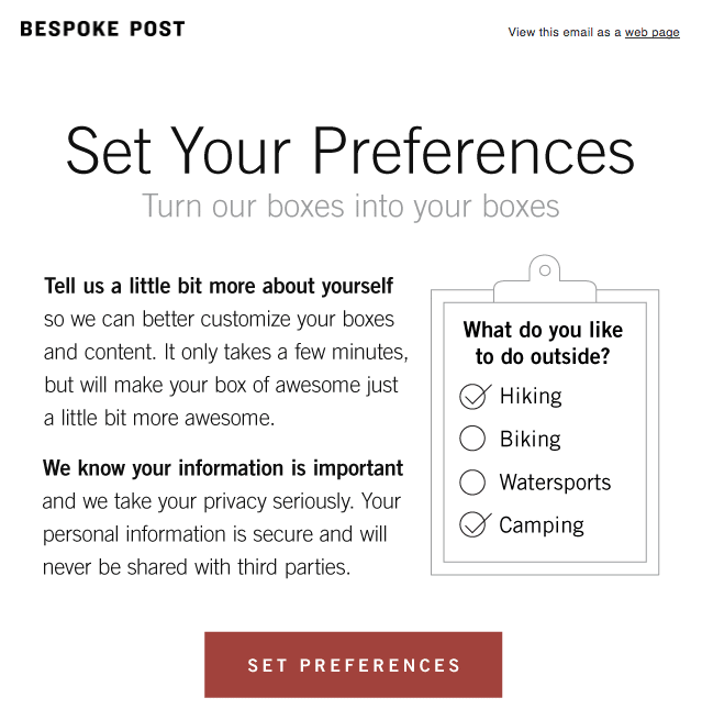
Bespoke Post's 'Preferences' email shines with its sincere and mutually beneficial appeal. The clear header "Set Your Preferences" establishes the email's purpose. Paired with the reassuring sub-header "Turn our boxes into your boxes", it implies the email is about the recipient.
Assuring the reader that their personal information won't be shared with third parties is a wise addition. Eliminating any potential user privacy concerns.
The inclusion of a clipboard image showcasing the nature of the questions shows they are non-intrusive. A single, clear CTA at the end prompts users to "Set preferences".
This email is an excellent re-engagement tool as it nudges the reader to help themselves. Indirectly encouraging engagement, and benefiting the company without attempting to make a sale.
See also: 7 Ways to Create Empathy in Email
Product or Service Updates - JIRA
JIRA is a project management tool from Atlassian. It’s often used by teams to help plan, track, and manage software development projects efficiently.

How it Works:
JIRA's product update email from Atlassian efficiently communicates the software's latest features. The Atlassian logo prominently tops the email, immediately recognizable.
The email's header text clearly announces the email's purpose: "What's new in Jira Software?" The sub-heading explains how these updates benefit the user, incentivizing them to read on.
First, a clickable banner separates the email header from the body. The first section announces a long-awaited feature: "You asked, we listened - dark theme for Jira is here!" This establishes that the company values user feedback and sets an anticipatory tone for the email.
The following sections provide a snapshot of additional updates. Each including a subheading, brief explanation, relevant image, and 'Learn More' anchor text. This format supports quick skimming and offers numerous conversion opportunities.
The email closes with a strong secondary CTA - offering further resources and support links. This efficient, easy-to-digest update email can effectively re-engages users and prospects alike.
Thank You Emails - Athleta
The Athleta clothing brand designs performance athletic wear for women and girls. From gym to travel attire, Athleta has built a reputation by offering comfortable and sustainable clothing.
How it Works:
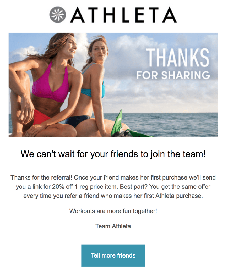
Athleta's thank you email is a perfect example of effective re-engagement. It begins with their logo banner, directing users to their website. Followed by a serene image with a clear gratitude message.
The email shows excitement about the referral, creating a sense of appreciation for the reader's actions.
Next, it elaborates on the benefits to the referrer. The gift of a 20% off coupon, mentioning the reward can be earned more than once. Incentivizing the reader to make more referrals.
Athleta adds a friendly, relatable message strengthening the brand-customer relationship. Signed by "Team Athleta" for personalization.
The email concludes with a clear CTA, "Tell more Friends", reinforcing the goal of earning referrals. Overall, Athleta's email thanks, informs, and motivates, making it a great re-engagement tool.
Re-engagement Newsletter - VEED (Bonus)
VEED is an intuitive video editing platform that allows you to add subtitles to your videos, merge and trim videos, add visual effects, convert videos, and create attractive content. Beyond basic editing, VEED lets you create stunning videos in just a few clicks with a simplified user interface.

How it Works:
VEED's newsletter is effective due to its thoughtful layout and rich content. With a clean overall design, it allows the recipient to skim the email effortlessly, emphasizing its visual appeal.
The primary topic, prominently featured at the top, captures the reader's attention, followed by clear CTAs in each section. The progression of the content, from the new "magic cut" tool to a creator's quote, video tutorials, and relevant blog articles, creates an engaging journey.
Moreover, the additional information surrounding the announcement, such as highlighting other related features, helps maintain the reader's interest. The 'read more' CTAs further motivate the recipient to explore more.
By meticulously crafting design and content, VEED's newsletter stands as an exemplary model for re-engagement emails. It not only guides the reader but also entices them to engage with the brand in multiple ways.
The Most Effective Re-Engagement Email Subject Lines
Crafting re-engagement email subject lines that work is a crucial skill. We've gathered diverse lines from various re-engagement categories to spark your creativity. Use these proven examples as a springboard to craft your unique subject lines that truly resonate with your audience.
Abandoned Action Email
Oops! Looks like you left something in your cart.
Finish what you started - we can help!
Did something come up? Your order is waiting.
Get back on track! Your profile isn't complete yet.
Discount and Promotional Email
Unlock your exclusive 20% off - Limited time only!
Make the most out of this deal - Save now!
Your next order, on us! 15% off inside.
Enjoy the savings - special offer just for you.
Educational Email
Level up your skills with our latest tips and tutorials.
Knowledge is power - Boost your productivity now.
Uncover industry secrets in our latest guide.
Stay ahead with this week's industry insights.
Event Invitation Email
You're invited: Exclusive webinar this Thursday.
Save the date - Join us for our annual summit.
Be our guest: Behind-the-scenes tour invitation.
Join the fun - Upcoming event details inside.
Milestone Email
Happy anniversary! Celebrate with us with a special offer.
Here's to another great year together!
Thank you for an amazing year! Let's reflect.
It's your birthday! Here's a special gift just for you.
Preference Email
Help us serve you better: Update your preferences.
Your opinion matters: Tailor your experience.
We're all ears! Share your feedback.
Fine-tune your preferences for a better experience.
Product or Service Update Email
Be the first to try our latest features!
Breaking news: Our new product is live!
Big updates to your favorite services.
New features alert! Check them out now.
Thank You Email
You made it happen: A big thank you from our team.
We're so thankful for your support!
You're amazing! Thank you for your loyalty.
Our success is because of you - Thank you!
Best Practices for Re-engagement Email Campaigns
Re-engagement email campaigns are a fantastic tool to bring back inactive subscribers. But, how do we make them effective?sHere we take a look at some of the best practices that can turn your re-engagement emails into winners:
Segmentation: This process groups your audience based on specific traits or behaviors. Understanding who you're talking to helps tailor your messaging and improve engagement.
Personalization: Personalization boosts email open rates by 82% compared to generic ones. Use the recipient's name or provide content based on their past interactions with your brand.
Timing: Consider when your audience is most likely to engage with your emails. Use demographic data and current trends to find the optimal sending time.
Data Analysis: Make use of your campaign analytics to identify patterns. Track email performance, and adjust strategies accordingly.
Readability: Keep your emails easy to read and scan. Break the text into smaller sections, use bullets, or employ bold fonts to highlight key points.
Clear CTA: Each email should have a primary, clear goal that can be achieved via a standout Call to Action button. Statistically, this button should have the highest click-through-rate.
User-Centric Approach: Make your email about the recipient. This strategy makes your audience feel valued and enjoy engaging with your content.
High Quality Images: Visually pleasing visuals can grab attention, boost interest, and help to break up text. Set the tone and make your emails more attractive by including branded pictures.
Check out these 35 great call to action phrases
The Difference Between Email Segmentation and Personalization
Email personalization takes segmentation a step further by tailoring content to the individual.
It means using specific information about the person receiving the email to make the message more personal. Instead of sending the same message to a group of people, you would use the person's name. Talk about their interests or previous interactions, and suggest products they might like based on what they prefer.
This makes the person feel more connected, leading to stronger relationships and loyalty to the brand.
Key Differences Between Email Segmentation and Personalization:
Email Segmentation:
- Divides the email list into distinct groups based on shared characteristics or behaviors
- Targets multiple recipients within each segment with similar content
- Tailors messages for specific audience subsets, delivering more relevant content
- Improves engagement and conversion rates with targeted promotions
Email Personalization:
- Tailors content uniquely for individual recipients using recipient-specific data
- Creates personalized messages, using the recipient's data like name or past interactions
- Recommends products or services based on individual preferences, creating a one-to-one communication experience
- Fosters stronger customer relationships and brand loyalty by deepening the personal connection
Conclusion
Re-engagement email campaigns are the key to win-back inactive subscribers. They can range from a simple ‘we miss you’ message to a special promotional email offer. Use subject lines and strategies based on re-engagement best practices to prove that email is effective. Repurpose our examples of how other businesses use re-engagement marketing. Then, try using these re-engagement strategies in your own campaigns and see the difference it makes!
Resources
How to Find Out Why Your Emails Are Not Going Into the Inbox


